
“Learn how to design effective DOOH creatives with three essential composition principles—hierarchy, alignment, and white space. Craft clearer, more impactful ads that capture attention.”
Haowei Yu
UX Designer, youdooh
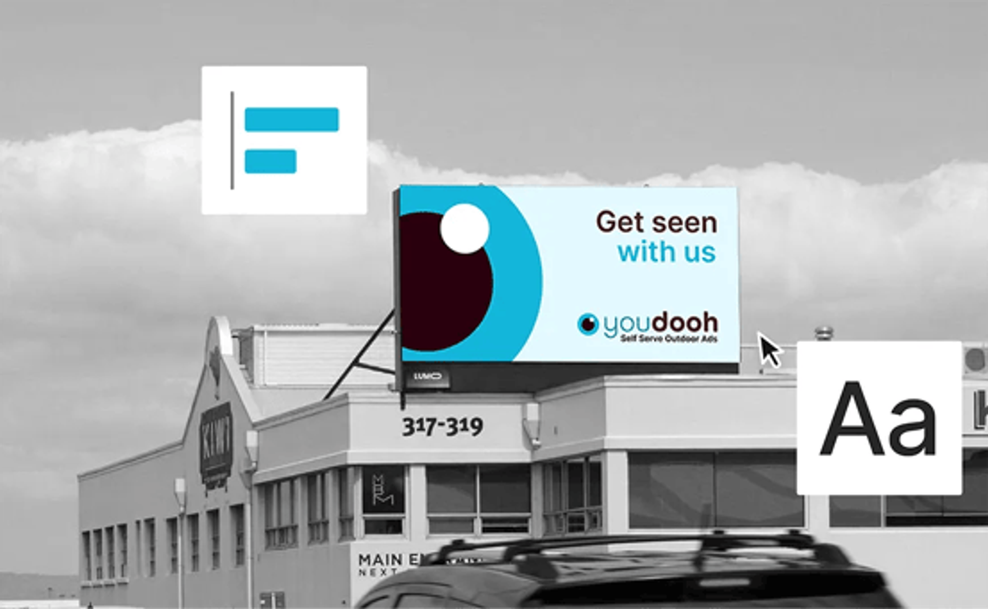
How to Design for DOOH: Essential Composition Principles Explained

Haowei Yu
UX Designer, youdooh
Need help designing your next DOOH campaign? We’ve pulled together 3 simple design tips to help you craft visuals that capture attention and communicate your message clearly.
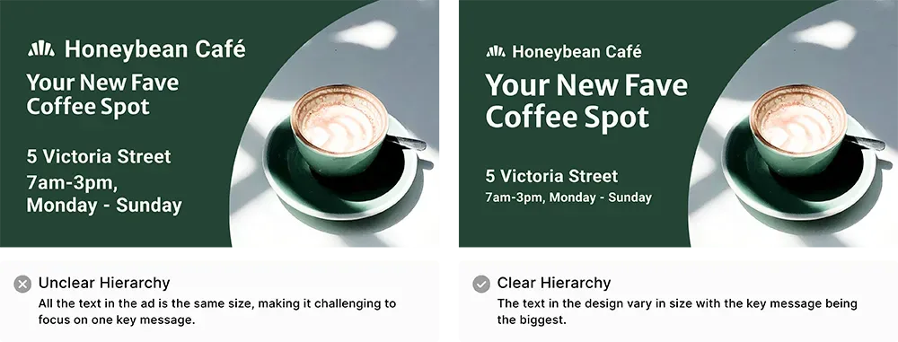
Hierarchy Visual hierarchy refers to how elements like text, shapes, and images are arranged in a design so that viewers naturally recognise the order of importance. The way you compose each item in your design affects how viewers consume the message you’re trying to convey.
A good layout would be to have a core message that is big and short, add a subtext that is smaller, logo and then a call to action. Use images to support your messaging whether that is through eyecatching colours or images related to your ad.
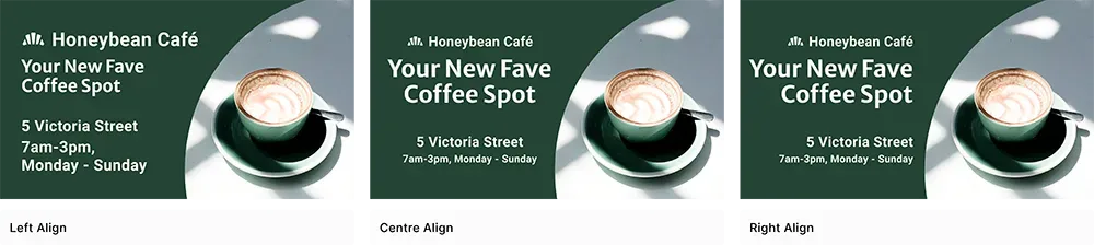
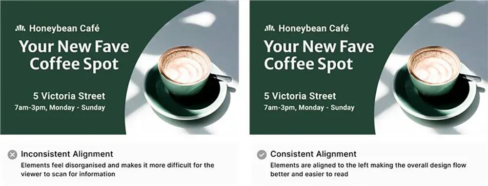
Alignment Alignment refers to how elements are visually connected with each other either vertically or horizontally. Good alignment makes your designs feel organised and structured. Three ways you can align elements could either be left, centre or right.
A good rule of thumb is to make sure that all the design elements are consistent, whether that is left, centre, or right. Consistent alignment makes it easier for the eyes to follow and read.
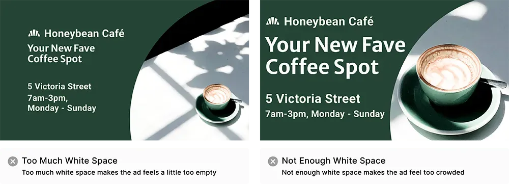
White Space White space refers to the empty space of a design. This could either be a blank background colour or background space in an image. White space is used to create separation between elements in a design, with the goal to create a good balance.
If you would like to learn more about how to get started in creating your own designs, check out our other article on how to create and format your design files for DOOH using free online tools.
Make sure to also read our Beginners Guide to DOOH Design
Digital outdoor advertising made easy
Get up and running in minutes